Raptive · Design Systems · 2026
Design Systems Token Vitals
Auditing what Discourse, the open source platform the community runs on, actually does in code, so a visual overhaul lands everywhere at once
Skill case study · the work is ongoing
design-token-vitalsGitHubGrades a front end’s design token layer, reports what it cannot prove, and ranks the fixes into a next move.Vitals, at a glance
What the audit returns first: eight vitals, four of them unproven. A hatched track is a reading not taken, never a score of zero. The graded rows are below. So is why that distinction matters.
Every component, ranked by reach
87 components, ranked by how much of the product each one actually touches.
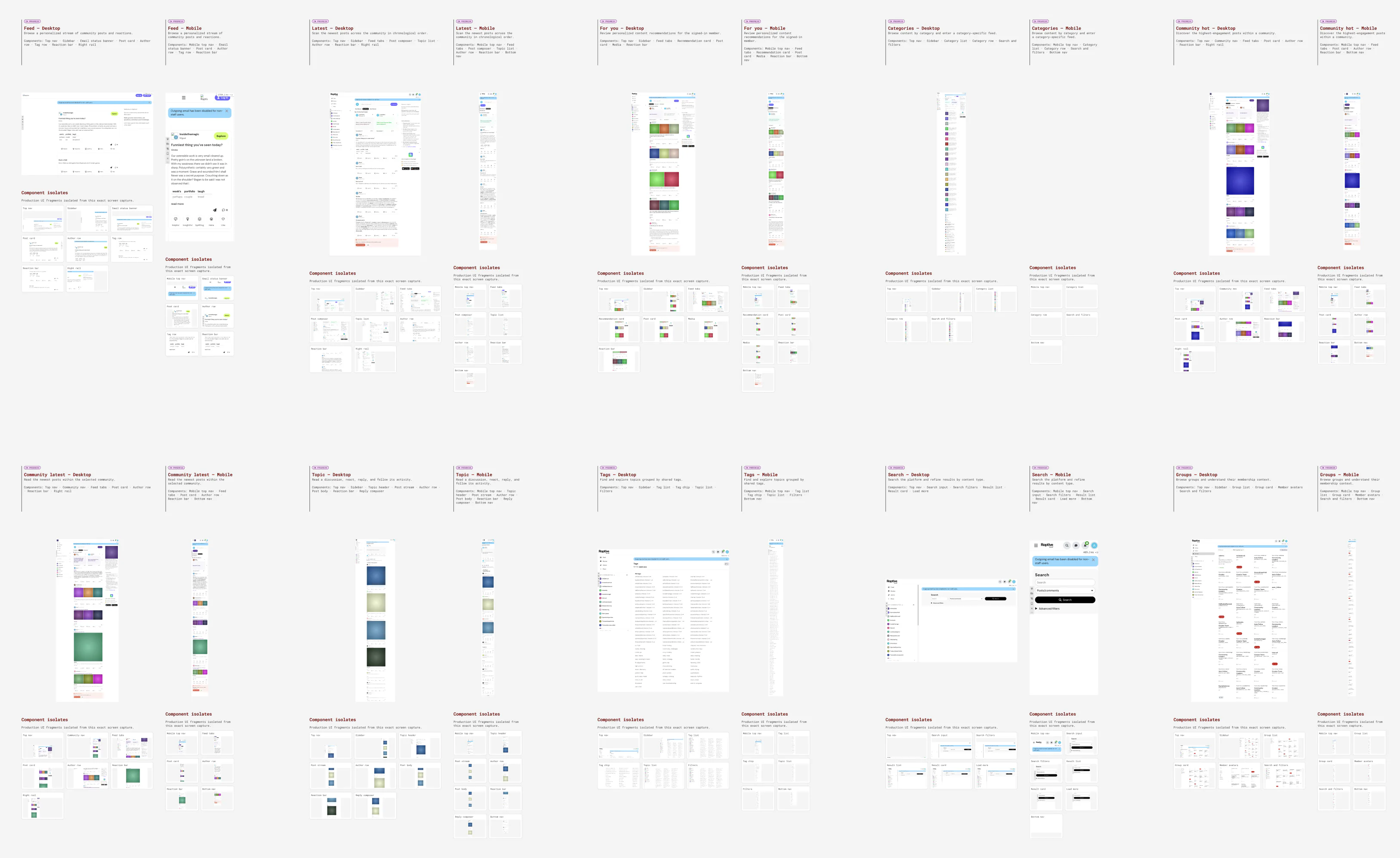
Every surface was captured at both screen sizes and reviewed as one screen. The desktop and mobile versions of the same thing count once. A component that repeats inside a screen also counts once. So the number beside a component is the share of the product that changes when it does.
Foundational controls and visual primitives.
- Button22%
- Form field16%
- Validation message16%
- Avatar9%
- Badge9%
- Search field9%
- Select / picker9%
- Selection control9%
Small functional groups built from atoms.
- Filter controls34%
- Reaction bar19%
- Author row16%
- Action group13%
- Feed tabs13%
- Profile tabs9%
- Data visualization6%
- Metric card6%
Reusable interface regions and complex modules.
- Top navigation88%
- Bottom nav30%
- Composer16%
- Activity list13%
- Post card13%
- Sidebar11%
- Admin navigation9%
- Review nav9%
Three components are platform-specific and the reach ranking is what proves it rather than assumes it: the bottom nav exists only on mobile, the sidebar and the right rail only on desktop. A contract written from the desktop screens alone would have shipped a component the mobile app cannot use.
Reframing the opportunity
The product did not have a consistency problem. It had a visibility problem: nobody could say which components a design change would reach until it shipped.
Raptive Community runs on a platform whose code was started in 2013, before design tokens were a practice and before CSS variables existed in browsers. Decisions about type, color, spacing, corners and shadows had piled up across the platform itself, Raptive’s own plugins, and two separate systems of style variable. Every one of them made sense when it was made. Together they had drifted apart. Change one foundational value and some components followed. Others reached past it to the raw color underneath. A third group read a mobile-only copy of the same value kept in a different file.
Then a rebrand was scheduled. New type, new colors, new buttons. This time the change had to land cleanly across the whole product. Finding out mid-launch that only some of the buttons had updated was not an acceptable way to learn.
- How might we see, before shipping, which components a token change will actually reach?
- How might we order a migration by evidence rather than by whoever asks loudest?
Three questions Figma could not answer
None of the three could be answered in Figma. Figma holds what we meant to build; the browser shows what actually shipped.
The audit
So I built the scanner. It reads the real code rather than a token file someone assumed was accurate, and grades what it finds.
It follows how the Sass and CSS files import one another. Then it separates the code Raptive owns from the platform’s own. It untangles every way a value can be written (plain values, groups, one token pointing at another, CSS variables) into one entry per real decision, and traces which files use each one. Those files are grouped into components; hard-coded colors are counted separately. Out comes eight graded vitals and a fix list ordered by impact. It works on any front end built this way and it is open source: Design Token Vitals.
One value, four names
Vital · Single sourceSame value. Four names. Nothing in the code connects them.
White appears 76 times across 20 files and answers to at least four different token names. The brand color has the same problem. Teams had each named the same decision separately, not knowing someone else already had. Renaming one leaves every other spelling of that decision untouched. Nothing in the code tells you which ones those are.
- --background-inverse
- --mobile-background
- --mobile-secondary
- --brand-primary
- --icon-brand-primary
- --mobile-primary-blue
- --raptive-primary-blue
The values are provably identical; whether they mean the same thing is not. The scanner will not merge them on its own. Deciding that a Google button and a mobile background are the same decision is a judgement call for a person, and the report says so rather than quietly combining them.
No shared contract
Vital · Tier integrityThe button pulls 26 different tokens, 74 times, from more than one file.
Some buttons read a named layer. Some reach straight past it to the raw color underneath. Some read a mobile-only override. Nobody chose that. There was no agreed contract and nothing standing between a deadline and a quick local fix.
The button, in evidence
369 rules across the product paint something button-shaped. Twelve of them say enough to actually draw the button.
So I drew every one of them from its own source. Each record carries the class name, the button as that rule paints it, the size and shape it works out to, the tokens it reaches for, and the file and line it came from. Then it sorts them by how much the code is willing to tell us.
A third instrument counting a third thing: CSS rules that paint a button anywhere in the product. That is neither how often the button component uses a token nor how many screens it appears on. 74, 22% and 369 answer three different questions.
Most certain first.
The twelve records we can trust most, and the reason the rebrand could not simply change one color: a neutral pill, a gray icon control, a white surface with a gray outline, a red fill, a red outline, a purple, two greens. Every one is a button. No two agree on fill, corner or type, and each points at a different file.
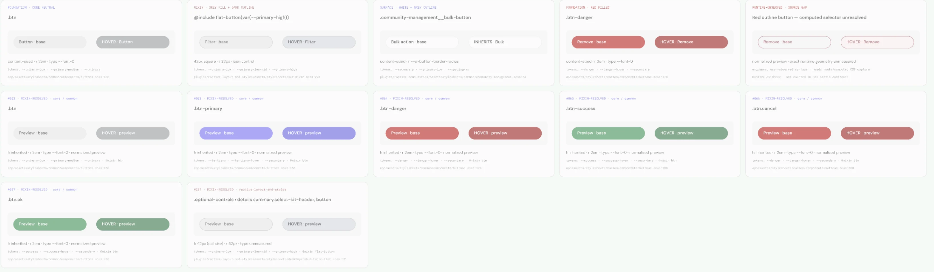
The gray and outlined placeholders are a rule rather than a style: they mean the evidence is incomplete, never that the button is gray. The same refusal the eight vitals make.
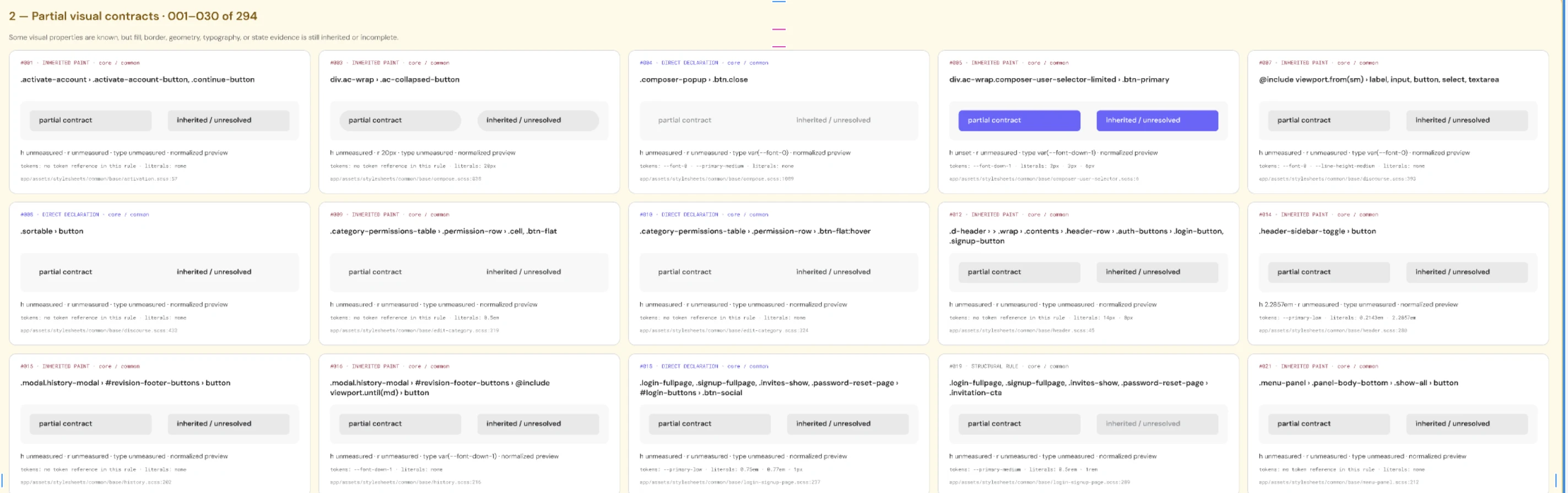
Fifteen of 294. The proportion is the point rather than the parade. Twelve rules can be edited with confidence. The other 357 have to be worked out before anyone can say what editing them would do. That is why “change the button color” was never a one-line job.
Two rankings
The button ranks first by how much code uses it. It ranks fourth by how much of the product you see it on, behind a navigation bar that appears on 88% of screens.
Both numbers are right and they answer different questions. Counting uses in code tells you where the work is. Counting screens tells you where a mistake would be seen. The button is 8.7% of all token use and appears on 22% of screens. The top navigation appears on 88%. I have not measured how much code it uses, so I cannot tell you whether it is the cheaper fix, only that it is the more visible one.
The two also cover different ground and mixing them up is expensive. The code audit found 479 tokens across everything the product loads, the platform included; the design-side inventory counts only the 118 Raptive owns outright. Neither is the “real” number. Quoting either without saying which count produced it is how a slide deck ends up wrong.
Three groups, three different needs
The same 87 components group a second way, not by how complicated they are but by what each group needs from the token layer.
Operational controls is the group that matters most and looks least urgent. Those components run almost entirely on values the platform fills in as the page loads. They cannot appear in a Figma library at all until each one is pointed at the same named color, spacing, corner and type groups as everything else. Building the library before that happens would produce a design system that quietly leaves out the admin, review and settings screens.
Eight vitals, four unproven
The audit reports what it can and cannot prove about itself.
- Naming coherenceFour naming styles are in use where there should be one.fail
- Tier integritySome components skip the named token and use the raw value underneath.attention
- Coverage14 of 19 token groups were checked. Five were never measured.attention
- Single sourceThe same value answers to several different names.attention
- Leakage26 hard-coded colors match a token exactly; 163 more have no token at all.blocked
- Mode completenessThe built light and dark themes have never been checked.blocked
- OrphansWhich tokens nothing uses is still unknown.blocked
- EnforcementNothing in the build stops a hard-coded value getting in.blocked
Blocked means the tool refused to grade what it never measured. Four of the eight say “no evidence yet” rather than inventing a number. An audit that grades everything is guessing with a scoring sheet.
Design, approve, migrate
Design somewhere the framework cannot argue back, get agreement on clean evidence, then migrate in the order the audit already proved.
One contract, two implementations
One agreed set of decisions. Two builds of it, each native to its own framework. Every output format generated, never kept up to date by hand in two places.
React reads the contract and produces React components. The platform reads the same one and produces its own. Both end up looking and behaving identically without sharing a line of code. The CSS variables, the Sass and the Figma JSON are all generated from it. That is what stops the two halves drifting apart. That drift is what caused the mess in the first place.
Button / Primary

  background        action.primary
  foreground        text.on-action
  height            size.control.medium
  padding-inline    space.md
  radius            radius.control
  focus-ring        focus

  states            default · hover · pressed
focus · disabled · loadingThe library, drafted
The combined library is drafted: 909 tokens across 14 groups, in one export meant to become the single source both Figma and code read.
It holds the raw values and a temporary bridge back to the platform in the same file. That is what will let the migration go component by component instead of all at once. The bridge is meant to be temporary. Every token in it marks a component still to be moved. It is not wired into production yet. Counting it as delivered would be counting the plan as the work.
Migration roadmap
| Phase | Why it sits here | Status |
|---|---|---|
| 1 · Buttons | The most used, at 8.7% of all token use. Not the most seen. See Two rankings. | Roadmapped |
| 2 · Typography | Everything after it sits on top of type. The DM Sans files are already confirmed from source. | Planned |
| 3 · Spacing & layout | Grid, gaps between components, padding inside them. Check the scale, then fill in its missing steps. | Planned |
| 4 · Color harmonization Vital · Leakage | Point the 26 exact matches at their token, sort the 163 with no match, and retire the duplicate names. | In discussion |
| 5 · Mode & accessibility Vital · Mode completeness | Build every light and dark pair, look at them in real screens, and check they pass WCAG 2.2 AA. | Next gate |
Buttons are the critical path: type and spacing both depend on the shape the button contract settles. The order follows measured use.
What changes
Locating a decision
Search 21 files, guess which components the change reaches, ship it and find out.
A ranked list of 105 components, with the file and line for every single use.
Shipping a visual change
The change reaches some components and not others. Discovered in QA, or after launch.
Components read one named layer, so a color change spreads for one reason instead of four.
Design against production
Figma and production drift apart until something ships wrong.
The audit draws the line between what is proven and what is not. Differences get written down, not discovered late.
What transfers
None of this is specific to one platform, or to a rebrand. It needs only a product where one decision answers to more than one name.
Any change that has to land everywhere at once asks the same question first. A rebrand, an acquisition or a design system’s second version all start there. The scanner reads Sass and CSS, so it fits most front ends built on them. It is open source. What it cannot do is read a value that does not exist until the page runs: a variable a theme changes after load is invisible to anything that only reads files. That limit is the same everywhere. Knowing where it falls is part of using the tool rather than a flaw in it.
The part that transfers without any tool at all is the order you do things in. Measure the code rather than the design file, because the design file holds what you meant and the browser holds what shipped. Rank the work by something you measured rather than by whoever asks loudest. And write down what you could not prove, so the next person knows where to look instead of inheriting a scorecard that graded everything.
What is proven, what is not
Proven
- 26 hard-coded colors that match a token and 163 that do not, each found at its file and line
- DM Sans and 17 brand colors confirmed from the real files, not from a spec
- A migration order based on measured use rather than on preference
Still open
- The built light and dark themes have not been checked yet
- Nothing in the build stops a hard-coded value getting in
- Whether those 163 values actually mean the same thing still needs a person to decide
- 70 tokens are still unsorted
- Whether this makes teams faster is unmeasured; the starting point is being recorded during rollout
The audit fixes nothing. It shows the shape of what needs fixing and puts it in order, which is the part a rebrand cannot be planned without. A rebrand is normally a visual change. Making this one structural is what makes the next one cheap.